How to choose the right charts for your data?
Illustrate, share, show, demonstrate, develop… So many verbs to refer to the visual depiction of data. It’s indeed for the purpose of “sharing data” that they’re first and foremost expressed in a visual form.

Illustrate, share, show, demonstrate, develop… So many verbs to refer to the visual depiction of data. It’s indeed for the purpose of “sharing data” that they’re first and foremost expressed in a visual form.
Discover how to choose the best data depictions for presenting your data in a professional setting.
Why create visual depictions?
Let’s start at the beginning: Why visually depict your data when you could be scrolling through all sorts of numbers and letters in outrageous quantities of rows and columns? The answer can perhaps be found in the question:
- To save time: Because if it was a question of reading data enriched and updated in tables on a daily basis for ten years, life would get shorter and shorter!
- For a clear and quick understanding: a table will provide you with details, but a chart will round it out in the form of a summary.
- To convey messages: the magic of rainbow curves and bars speaks a universal language! Beyond the purely linguistic aspect, these visual depictions of data allow different departments within an organisation to communicate.
- To attract attention, provide impact and highlight the essential.
“Translating data into a visual context”, in short, allows messages to be synthesized into a more digestible form so they can be understood at a glance. Preparing a presentation for colleagues is commonplace, regardless of the size of the organization, However, we’ll see that not everyone knows which graph, histogram, diagram or other type of visual depiction is the most appropriate for conveying the right message.
A common error: a pie chart to rule them all
Besides the temptation of using it incorrectly and indiscriminately, what do we really know about the beloved pie chart? Charts of this type are often referred to as “sector graphs”. They allow you to highlight the various parts of a whole. The sum of the various sectors represents a totality, a whole, “100% of…” (and that’s true, of course). But the trouble is that often, when we’re speaking of charts and graphs, everyone wants to use a pie chart without really knowing its advantages or disadvantages.

Above, a very common counter-example of a pie chart that’s lacking:
- Some of the portions have the same color, which makes it difficult to read.
- It seems that this table has too many guests: the pieces are sometimes so small that their legend is truncated.
- What do we want to highlight here? It’s difficult to distinguish large differences in proportions between most of the sections.
“A pie chart is only compelling if it represents the various parts of a whole.” (EUREKA!) An impactful pie chart is a chart that smells like coherence! It can only be tasty if its various sections find order and visual harmony. As Hubspot explains in this blogpost, it’s a question of presenting the various parts of the pie chart from the most gourmet to the most dietetic so our eye sweeps over the whole and delights in its logic.

A pie chart presented from the largest to the smallest sector, clockwise, for a more intuitive scan.
The pie chart should not be adopted as the ultimate standard. Indeed, you must think of your graph in relation to what you’re looking to highlight. With this in mind, a world of possibilities opens up before your eyes for better viewing and showing…your data!
Informing, impacting
Graphical representations that allow you to inform…mean everything and nothing. In reality, you certainly know some of them, very eloquent and specifically used in meetings in front of a dozen sleeping colleagues. It’s a number or a figure, accompanied by a title, which makes it possible to showcase essential data. In other words, an indicator. It informs immediately. Here are some examples to provide you with some context:
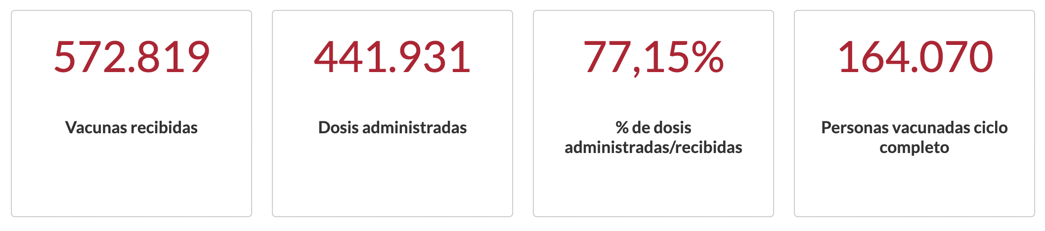
Source: Epidemiological situation of the coronavirus (covid-19) in Castile and Leon.
Within a dashboard, this visual depiction allows you to provide an initial overview of the key figures you’re looking to highlight.
If you like this presentation of key figures, make sure to check out our code library to find an even more enticing version: animated KPIs (quite possibly my favorite)!

The gauge allows for an initial presentation of the impacting data. But how should you proceed when you’re looking to make a comparison?
Dataviz to compare your data
To highlight the large size of pachyderms in comparison to the small size of culicids, you can easily draw proportional maps, bar graphs or histograms. Have I already lost you? These examples will pique your curiosity:
Stacked bar charts in percentages allow you to compare various sub-categories and put them in competition with listed items (as shown above).
Some sets may be more readable in a stacked bar chart format without percentages, for example:


The “percentage” view gives the impression that the share of retailers, independent entrepreneurs and artisans per department is the same each year (at first glance). However, in reality, it’s not the case; hence the importance of managing the way you present your information!
Another example:
This time, you can try displaying the percentages:
Source: Understanding Stacked Bar Charts: The Worst Or The Best?
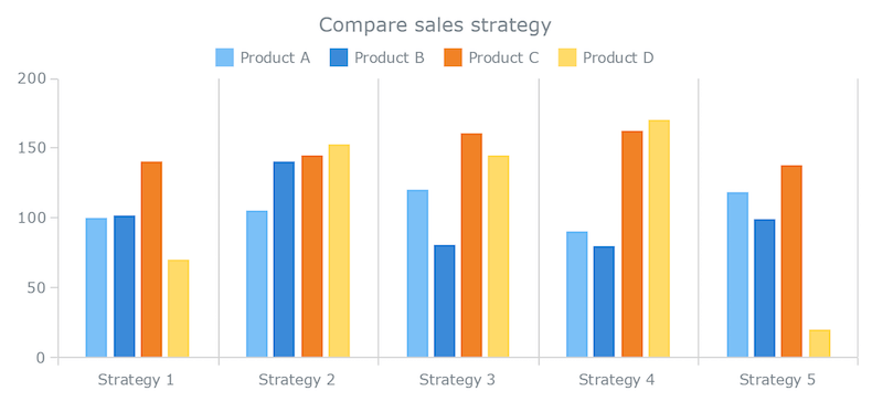
Multi-series bar charts allow you to compare groups of elements, individuals, products, etc. Above, we can observe five types of business strategies and their effectiveness according to product (here, products A, B, C and D). As such, we can imagine that this portrayal of the data will allow us to draw conclusions on the best business strategies to adopt. Strategy 3 seems to be the most effective for selling product C, and strategy 5 seems ineffective for product D, etc.
To learn more about the use of multi-series bar charts and stacked bar charts, please read this article, which will allow you to avoid many errors and mix-ups in the way you use them.
To compare several values, you can use bars, curves, lines (solid or not) or a treemap, all with an easy-to-use color code (especially for people with color blindness) to identify the different variables. Adobe has a a color palette generator for you to use.
A reference that can also be useful for all types of compositions.
Highlighting “sectors”
As we mentioned earlier, the pie chart is a member of the sector chart family. There are others, such as the ring (or donut), the semi-circle and the irregular. These graphs can, of course, allow us to draw comparisons or identify the various proportions of a set. However, let’s not kid ourselves. Though they’re easy to create and to read, sector charts offer very limited comparisons at the risk of ending up with extremely small proportions and legends that are impossible to relocate correctly.

Source: How to Choose the Right Chart for your Data
Let’s keep in mind that sector charts don’t allow (or allow only slightly) you to make comparisons or to create reports that evolve over time.
Changes over time and place
Looking for a little recreational break? No problem, we have prepared some visual depictions for you to “take you on a mental journey”:
These examples show the evolution of a variable over time. Above, bicycle speedometer data provides a good overview of the evolution of the data both over time (a breakdown by hours, days, weeks, months, etc.) and place (routes with a dedicated bike lane). We identify peak hours, more or less frequented routes and many other points of analysis that will allow us to improve infrastructure.
More intuitive, a map will allow you to locate points in space. And very often, these will couple with the evolution of one or more variables in time and space:
Organizing your filing cabinets
When you have only one variable in the form of steps, it’s best to use conversion funnels (well known among marketing teams) as well as mind maps and other flow charts.
These types of graphs are like a checklist: all the elements are visible and organized, and you can see their direct evolution when defined.
The right charts for correlations
Are you familiar with data cross-referencing? Putting several variables in relation to each other to shed light on a correlation is the purpose of this type of graph.
Correlation between gas prices and petroleum product prices
You can also make data say the most absurd things (with a lot of humor and a bit of clarification on the lack of seriousness, you never know). Such is the case on the “Spurious Correlations” website. For example, it correlates divorces in Maine with margarine consumption…Could butter be the cement of marriages?
A little practical application
What did you think about this journey through the wonderful world of dataviz? Keep your concentration up! A quiz awaits you on ODS Academy to test your knowledge.
Memo
- A visual memo from “The extreme presentation method” is available here.
- Venngage has also produced an infographic and a video on the subject.
- As mentioned earlier, Hubspot also has an article on how to depict your data visually, including proper presentation and appropriate colors!
- JUICE LABS shares a “chart chooser” tool which helps you define which data depictions are best for which types of analyses (comparisons, distributions, compositions, etc.).
- And finally, here’s a Prezi article (in French) to advise you on the use of various graphical representations for your data by introducing you to the types of graphs and their advantages.


