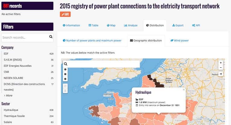
Why a Custom View Will Make Your Data Dashboard More Relevant
How you present your data is crucial to engage with a larger public. This blog post is all about custom view features for your data dashboard and how they will make your data more relevant.
One of the key moments of the global open data movement has been Tim Berners Lee’s 2009 presentation in which he described his view for web of linked data. This soon lead to the formalization of the 5 star rating system encouraging people to not only share their data, but share them in an open, structured and linked manner so that they become fully machine readable. With 5 star open data, systems exchange data with one another and provide all the necessary context to interpret these data.
What this approach doesn’t address though is the difficulty people have in interpreting the data. Linked systems provide easier access to the data itself to any citizen, but their interpretation remains the ability of a few, data-science literate, people. Although data presented in HTML and PDF is hardly open data it does provide to the (human) reader all the keys he or she needs to interpret the data. The data producer can include graphs, make long technical explanations about the underlying data-collection methodology, go into detail about the impacts of what is being measured in the dataset on the organization he/she is part of. All of this may not be relevant to a machine or an expert but it is crucial to engage with a larger public.
At Opendatasoft, we know that standard metadata just isn’t enough. One of the most widely-used features of our portals is the ability to write dynamic dashboards. They enable our customers to provide analysis and not just raw data. They allow them to explain the underlying meaning of their data. They are a way to connect and compare separate datasets. They are the most natural way for them to address their public. The only drawback? Separating this analysis from the underlying data.
In order to make the datasets themselves ever more readable and understandable, we created a new space right within the dataset page left entirely to the data producer. He or she can now have one tab to write everything deemed necessary for a user to best understand the data. Better yet, this tab behaves like any page on the platform and can accommodate dynamic visualization through our widgets and dynamic interfaces though AngularJS code.
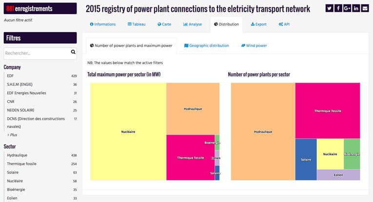
In this article, we’ll dive into the possibilities of this new feature. We’ll build together a rich dashboard containing both dynamic and static views and plenty of written content. And we’ll add it to our underlying dataset’s page in a custom tab which icon and title we control.
Building a Rich Custom View
In order to illustrate the possibilities of this custom view, we’ll step into the shoes of an energy distributor (in charge of power distribution in a given territory) in France. This distributor has a dataset about the origin of the electricity supplied.
While the dataset itself is very well built, its content is mostly understandable by people working in the energy sector. In order to expand its potential audience, the distributor decides to build a custom view enabling more people to get a good understanding of the data.
The chosen axes for analysis are the following:
- A view showing the number of power plants connected during the year versus the corresponding maximum power production, broken down by nature (nuclear, wind, solar…)
- A view showing the geographic implantation of these power plants
- A view focusing on the wind turbines, showcasing which companies contribute the most to this specific power source on both ends of the distribution network (large nation-scale companies and local producers).
Dynamic Views
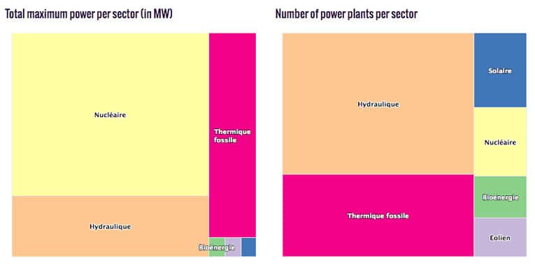
The very first view uses two treemaps, one focusing on total production capacity and the other on the number of power plants. Since we’re building a dashboard, we could go directly to the widgets documentation and read how to create treemaps, but a much more efficient way is to use the graphical tools of the Analysis tab and copy the generated widget code.
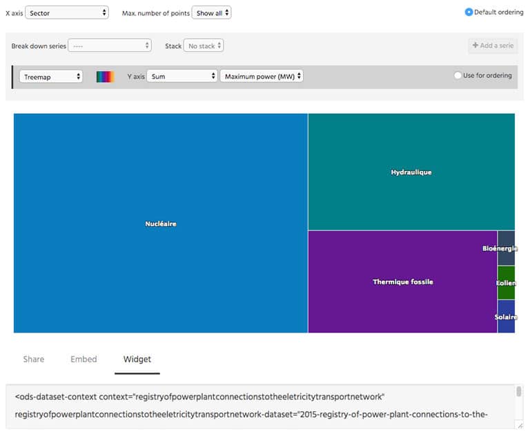
We can therefore copy and paste the code for the first widget.
If we copy and paste this code within the custom view code editor, the treemap will indeed show up, but a search or a click on one of the filters will quickly reveal that they have no impact on the visualization.
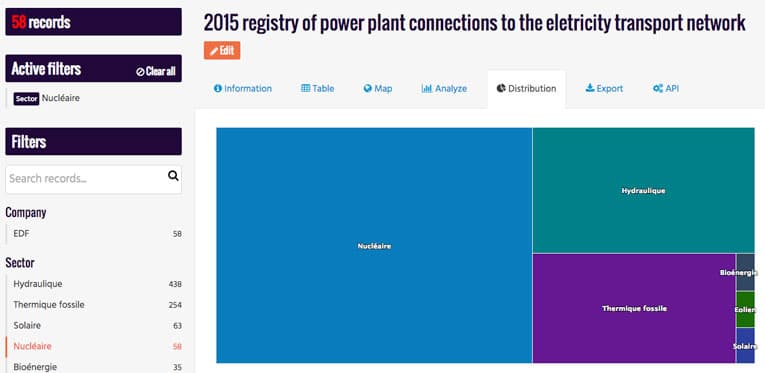
This is because the chart relies on a custom dataset context, named in this case
registryofpowerplantconnectionstotheeletricitytransportnetwork
(very long name that was generated from the dataset’s name) and not on the page general context, named
ctx
In order to use the existing dataset context and not a new, independent one, we have to update the widget’s code as such.
This time we can see that the visualization is indeed connected to the filters in the page.
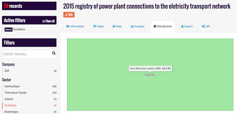
Now we can replicate the procedure for the second visualization and update the layout to present them both side-to-side.
The remaining dynamic visualization is a bit more complex since it involves a map. The ods-map widget, while very powerful, is a bit difficult to use, and the cartograph isn’t based on the ods-widget library and therefore doesn’t generate code to use in dashboards. Thankfully, a new map builder is in the works (and is available in beta for a happy few) that does the code generation and that provides graphing tools to customize its appearance.
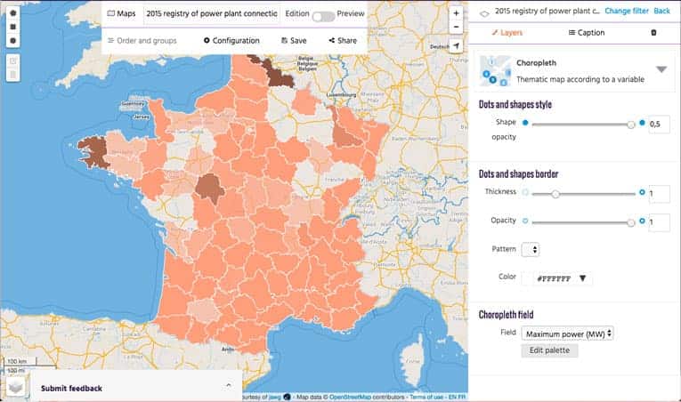
Using this tool, we can copy/paste the corresponding widget’s code.
What’s left is to remove the dataset context defined in the export and replace it with a reference to the page’s context.
Curious about this new map builder? Ping us on Twitter to learn more.
Static Views
On top of these 2 dynamic visualizations, we’d like to dive deeper into one particular aspect of the dataset: wind power. And we’d like to cross-reference the data from the dataset with data from another published entirely and display side-by-side the same analysis performed on two separate datasets.
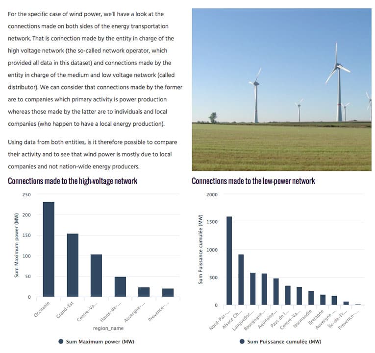
As with the previews, we’ll start by going to the analysis tab on each dataset page and use the interface there to build our two visualizations. This time around though, we do not need to modify the generated widget code since we do not want these visualizations to change with the filters. We can simply copy-paste the code into our dashboard.
As for the image used in the dashboard, it was taken from Wikipedia and could have been linked there directly, but by using the assets section of the back-office, we’re able to use our own copy and therefore be safe if the original ressource moves or is deleted.
The Final Dashboard
Now that we wrote code for each of the views that interest us and have connected those views to the current dataset context when relevant, all that is left is to wrap these visualizations in a bit of layout so that we don’t overwhelm visitors with too much information.
The easiest way to do so is to use the ods-tabs and ods-pane directives. These are handy shortcuts built in the platform and used to create tabbed navigation within a page.
And voilà! Our dashboard is complete, integrated within the dataset’s page and conveys better than the description field what the key points of this dataset are.
