Dashboards, data stories, maps: which data visualizations should you choose?
Dashboards, data stories, interactive maps… There are many types of data visualizations (or dataviz). In this article, we outline the different types of data visualization, understand who they are for, and how to choose and use them to their full potential.

Organizations generate and collect a huge amount of data from business applications, sensors and customers. However, this raw data can be difficult to understand, making it hard to identify opportunities, or to detect and solve issues. Even if data is organized into lists or catalogs, it can be difficult and time-consuming for non-specialists to understand and use it.
In our survey of more than 200 managers, 74% said that data should play a key role in the decision-making process. So, how do you make your data intelligible and easily understood by everyone inside and outside your organization, whatever their skill level?
Data visualization (or dataviz) provides the answer. By representing data graphically in ways that the human brain can understand more easily, it is simpler to gain insight and improve decision-making for everyone. In this blog we explain the different types of dataviz and their benefits, illustrated with real-world examples.
Dashboards, data stories, interactive maps… There are many types of data visualizations (or dataviz). In this article, we outline the different types of data visualization, understand who they are for, and how to choose and use them to their full potential.
What is a data visualization (dataviz)?
Data visualization (or dataviz) is a way of visually translating raw data into something graphical . The goal is to make the data easily understandable and to turn it into an intuitive analysis tool for all stakeholders, even for those without technical skills.
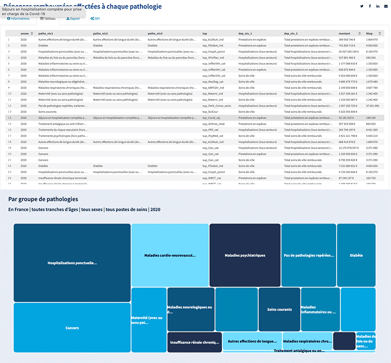
This Health Insurance open data portal illustrates this approach perfectly. The portal brings together data on spending on particular diseases and medical conditions. When displayed in a tabular form, it is very difficult to understand it or to extract insights. However, if you take this data and present it as a dataviz, it is much easier to read and understand. With this interactive dataviz, we can see at a glance that the largest group of spending is on one-time hospitalizations.

Data visualizations therefore make it possible to quickly access essential data. Every organization that generates data can benefit from this approach, analyzing their data through tools and visualizations that improve decision-making, simplify the distribution of information, and add value.
What are the important criteria to consider when creating a quality data visualization?
To ensure that your data visualization is understandable, it needs to meet certain criteria, as we explain below.
The basic criteria:
To provide relevant and reusable data:
- Define your target (who is the user?) so that your dataviz is consistent and tailored to your audience
- Enrich your visualizations by comparing your datasets with other data
- Provide full details about the datasets used in your visualization, so that users can see what they cover.
Best practice:
It is essential to present your dataviz in an attractive, user-friendly, and easily understandable format. Follow these best practices:
- The format of the graphic (columns, rows, pie charts, sectors, bars, etc.) must be appropriate for the type of data you have and the way you want to display it
- Add thematic filters that allow everyone to analyze the data in an interactive way
- Use colors that make it easy to understand the nuances and insights revealed by your data, and these colors should also reflect your brand image
- Use captions and text that make it easier to understand and contextualize your data.
Who is data visualization for and what are the benefits?
Data visualization is especially useful for presenting data to non-expert audiences. It is an essential way to deliver a simple data experience that is relevant to all stakeholders, whether employees or citizens. Data visualizations also help more expert audiences who are looking for greater efficiency and want to eliminate time-consuming manual analysis tasks.
Everyone can benefit from the advantages of data visualization:
- Within the organization, by offering interactive reporting and monitoring dashboards. The aim is to make data-driven tools available to everyone and to enable all departments to optimize their decision-making processes.
- To create data services that meet the needs of partners and make it easier to collaborate.
- To communicate with as many people as possible in simple and immediately understandable formats. Visualizations can easily be inserted into applications or websites. That means they provide positive benefits in terms of understanding, visibility and transparency.
Graphs, diagrams or maps: which data visualization should you choose?
When choosing the visualization which is best suited to your data and the message you want to convey, focus on these key criteria:
- The context: what is your goal and what is the audience of your data visualization? What do you want to demonstrate?
- The nature of the data you want to enhance: What kind of data is it? (geographical data, reference data, financial data, etc.)
- The correlation between your data: What is the link between this data that will allow it to be compared? (evolution over time, comparison, ranking, distribution, correlation, etc.)
If you have geographical data or data related to a geographic area, a map is the most relevant choice. For example, Kering presents the data from its Environmental Profit and Loss (EP&L) statement as a data visualization. After showing its environmental impact data as a value, Kering created an interactive map. Users can then easily gain insight into Kering’s worldwide environmental impact and then filter the information, such as by country or type.

To represent evolution over time, timelines and diagrams are the tools that work best. On its portal, the Metropolis of Aix-Marseille-Provence uses timelines to present the latest data posted online, or upcoming tourist and cultural events.

If you want to compare data and highlight nuances and differences between them, charts and graphs are the most suitable type of dataviz. There are many kinds of charts (bar, stacked bar, line, pie, horizon, waterfall, timeline, etc.). For example, the city of Bristol uses a bar chart to present the quality of life of its citizens.

If you are looking to represent a ranking, particular charts are more suitable (ordered column, ordered bar and parallel column charts). The Department of Hérault uses different shapes to represent the classification of its population, as you can see on its portal.

To represent a distribution in your dataviz, you need to choose a shape that allows you to highlight the distribution, such as whisker box plots, histograms, density plots, or even violin plots.
If you want to represent a correlation, you can use heatmaps, scatter charts, column and line charts, or even bubble charts.
For example, the Caisse Nationale d’Assurance Maladie (CNAM) decided to combine the representations of a distribution and a correlation in this dataviz. This map, which gives the prevalence (in %) of cancers in the department of Paris, makes it possible to understand the distribution of people treated for cancer and to understand how it correlates with geographical areas.
Dashboards, data stories: how can you enhance your data visualizations?
To enhance your visualizations, it is essential to contextualize and highlight them with text, explanatory captions, headings or even special themes and formats. Depending on your need, you can choose between dashboards or data stories.
Dashboard: action management, reporting, operational management
A dashboard is made up of different types of data that allows an in-depth analysis of specific objectives.
Dashboards are useful at all levels of the organization and also work externally for communicating with partners. There are several types of dashboards:
- Decision-making and reporting dashboards are very useful for quickly analyzing a specific situation. The organization’s KPIs and business objectives are defined beforehand and can be monitored at a glance on this dashboard. This makes it easy to determine which decisions to make
- Financial dashboards bring together indicators and provide financial analysis to help decision-making
- Operational dashboards make it possible to trace problems in the field, or to view the organization’s activities. These dashboards are often created to allow citizens to monitor public activities
- Thematic dashboards are used to analyze a particular subject in greater depth and to offer customized dashboards to partners.
Here are some examples of dashboards:
The Healthy City Dashboard, an operational tool for the City of Vancouver
The City of Vancouver has created its “Healthy City Strategy.” This aims to build an equitable, sustainable and resilient local community to give everyone an opportunity. Multiple goals to address social and societal issues have been set.
To monitor its progress towards its goals, it has created the Healthy City Dashboard. This provides everyone with access to indicators showing performance to date.

Because it is structured by goal, the dashboard makes it possible to quickly and easily view specific indicators. As it highlights changes and provides all essential data at a glance, it enables everyone to see progress and areas that require greater focus.
EDF’s CSR commitments dashboard
EDF used our no-code ODS Studio solution to create a dashboard to share its CSR indicators in a simplified form. With this dashboard, it is simple to see progress towards each CSR commitment and to highlight planned activities towards achieving each goal.

Data stories: thematic immersion in data
A data story is different because it is structured as a narrative. Composed of contextual elements, key figures and dataviz, its goal is to present the data through themes in order to tell a story.
This format is generally found on open data portals because it makes the data easier to understand for the greatest number of people.
Thus, on community portals, we often find data stories, such as the following:
Cary, North Carolina has created a range of data stories on specific topics, using information to inform and explain. These range from stories on the town’s trails and greenways, to the impact of the opioid crisis.

As part of its open data strategy, the Spanish province of Castellon used our no-code tool ODS Studio to create various data stories, including this data story about the availability of accommodation in specific hotels.

Some players in the private sector also offer data stories:
Datajoule: French municipalities with gas supply
Akajoule is an energy efficiency and renewable energy design office. Akajoule created the “Datajoule” concept, a new solution designed to enhance energy and environmental data.
An interactive data story was created to share information on gas supply to all French municipalities and citizens. The data story offers all the important information on a single page and provides details about the gas supplied to specific municipalities.

In addition, the Opendatasoft platform allows you to aggregate dataviz from all the analysis and BI tools on your dashboards and data stories. The solution is placed at the center of your technology stack. It allows you to quickly and easily generate materials that put data at the center of your organization’s decision-making, including for your employees who are not data experts.


