What Can Open Data Tell Us About New York Taxi Journeys?

Read this blog post and explore data about yellow taxi journeys in New York City.

Last week, New York City opened data from millions of taxi trips. 165,114,361 to be more precise. At a time when war rages between taxis and Uber, just a few days after the clash between NYC’s mayor DeBlasio and Uber, it looked like a good a idea to play with this data by uploading them into the Opendatasoft platform and displaying them on a map and as well as on graphs and charts!

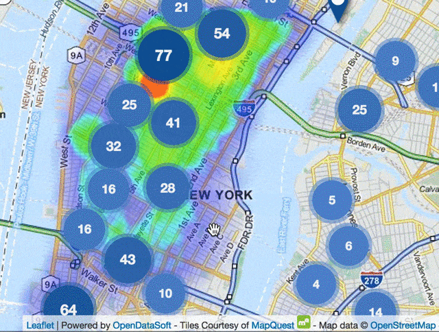
South of Manhattan, NYC, Heatmap of Taxi trip pickups and Subway Entrances location
Some Facts
As we could expect, there are more and more taxi trips during the week, peeking on Saturday.

The month by month evolution seems to show more taxi trips during Spring and Fall:

It would be interesting to wait for 2015 data to see if there is a real pattern though.
Reverse Engineering of Taxi Pricing
Here are, given a trip’s fare amount, the average distance and average duration of the trip:

It may be worth trying to recreate a pricing model from this data and create an app that tells you when you are way too far the average, or by filtering on the pickup location checking if part of the New York City population is being disadvantaged as some people claim.
About Data Quality
For a dataset this huge, there are not a lot of errors or bad data, but absolutely clean and perfect datasets are really unusual. Data visualization and mapping are good ways to find some incorrect data, especially when you have 160M rows to check! The first, and most basic, example is bad geographical coordinates:

I know Uber has launched Uber Boat in Istanbul but most of the markers far from NYC are probably incorrectly located. With the same idea, we can see that there are both very long trips – 13 days – that may need more investigations, and trips with negative duration, that don’t need any investigation:

Smart Cities 101
The harder the funnier, we’ve created a heatmap of every pickup locations in 2014 (~160 million, remember) and add the Subway entrances as a layer. It’s pretty amazing to navigate that easily in those huge datasets!
By implementing some route calculation between the subway stations, we could compare every taxi trip with a public transport trip and understand better how people behave, why, and what the city can do to improve their lives. That would be a nice first step in the development of a Smart City:


In September 2017, Citilog deployed its CTCloud platform in Atlanta, in collaboration with the city’s North Avenue Smart Corridor project. The city seeks to better understand traffic along the corridor, enable real-time adjustments to traffic light timing, and ultimately reduce emissions and pollution in the city to improve the wellbeing of its residents. Read about how Citilog built its cloud platform in partnership with Opendatasoft to offer its customers a digital service for traffic insights.

Driven by the need to decarbonize, increase efficiency and meet changing customer needs, the transport and mobility sector is undergoing a rapid transformation. Data is at the heart of this, with data portals critical to building an effective, sustainable and customer-centric transport ecosystem.
In September 2017, Citilog deployed its CTCloud platform in Atlanta, in collaboration with the city’s North Avenue Smart Corridor project. The city seeks to better understand traffic along the corridor, enable real-time adjustments to traffic light timing, and ultimately reduce emissions and pollution in the city to improve the wellbeing of its residents. Read about how Citilog built its cloud platform in partnership with Opendatasoft to offer its customers a digital service for traffic insights.
Driven by the need to decarbonize, increase efficiency and meet changing customer needs, the transport and mobility sector is undergoing a rapid transformation. Data is at the heart of this, with data portals critical to building an effective, sustainable and customer-centric transport ecosystem.