Choosing the right data dashboard to improve decision-making in your organization
Data dashboards are central to driving increased data consumption and value. Our blog provides an in-depth guide to choosing the right type for your needs, along with best practices to drive success and extensive user examples.
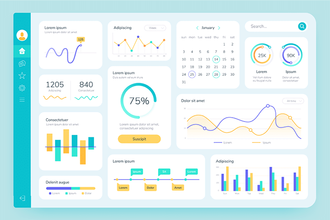
Organizations of all sizes across every industry generate increasing volumes of data through their day-to-day activities. Turning this data into value and increasing its consumption is critical to improving operations, driving efficiency, and monitoring performance. But to take real advantage of this data and use it to demonstrate performance, make better, faster decisions, and drive innovation and collaboration, you need to collect it in one place, enrich it with other data sources, be confident that it is high quality and be able to share it widely in relevant formats that meet user needs.
Data dashboards enable this seamless sharing and therefore underpin more informed, insight-driven decision-making. They are a type of data product – a ready-to-consume, accessible data asset designed to meet the specific needs of a large number of users.
What are the advantages and potential uses of data dashboards? How can you build the best data dashboards for your organization? Find out more in this article.
Data dashboards: understanding the benefits for your organization
A dashboard groups selected data together, and displays it graphically, normally via a web page or app. They are interactive and enable users to drill down to learn more about specific metrics or data, and provide a link to the underlying data to build trust and transparency. Data dashboards enable users to:
- Consult accurate data in real-time: By automating connections with your data sources as soon as new information appears, dashboards are automatically updated. This allows decision-making to be based on the latest, most reliable information.
- Centralize and enrich data: through the dashboard format, you can centralize data from different sources and different datasets, as well as enriching it with reference data or geographic information. This brings context to data, allowing it to be easily interpreted, understood and consumed.
- Visualize data: to simplify understanding of data, you can group different types of visualizations (such as KPIs, graphs, maps, and timelines) together. These data visualization dashboards allow users to quickly visualize trends related to a specific area.
- Customize your dashboard: each department within the organization can tailor its dashboard based on its needs. They can customize through the choice of performance indicators, visualization methods, and data sources used, for example.
Ultimately, the dashboard is a powerful decision-making tool that allows users across the organization and beyond to use data to make the right strategic and operational choices.
Who are data dashboards for?
Data dashboards are created for different purposes and can be used by different groups inside and outside the organization.
Employees
Data dashboards are essential self-service tools for employees with internal data product marketplaces providing access to different data analytics dashboards, organized by theme and accessible by search to enable fast discovery. The objective is to provide a single version of the truth that shares strategic objectives and key performance indicators (KPIs) internally in order to improve operational efficiency and to empower teams. Dashboards are also an invaluable support for executives and managers who can report on their activities and take action if they spot issues.
Some organizations provide front-end business applications that allow employees to interact with and update key data dashboards. For example, by reporting a safety incident in the workplace, the numbers on a health and safety dashboard could be automatically updated in near real-time.
Organizations can also share their vision and objectives via dashboards, showing progress towards achieving them. This transparency helps to strengthen the commitment of employees to the organization, keeping them informed and engaged.
Customers and partners
Beyond employees, organizations can also share some of their dashboards with customers and partners in their ecosystems. For example, they can share an inventory status dashboard with suppliers to help supply chain planning or network information with external service and maintenance partners. Data can be monetized by selling access to tailored data dashboards, opening up new revenue streams and enabling market differentiation.
Sharing data analytics dashboards with partners can take different forms:
- Creating restricted access to the organization’s internal data marketplace
- Creating dedicated, standalone dashboards on an independent marketplace, either for free or in a monetized form
Sharing data with partners allows organizations to create value in their ecosystem and to potentially increase revenues. However, as partners are not internal employees, companies must be extra vigilant in managing access rights and security, as well as protecting confidential and competitive information.
Citizens, customers, media and other stakeholders
In addition to corporate dashboards aimed at a specific business audience, companies can create freely-accessible data dashboards on their public data marketplaces.
These can share the organization’s own data, as long as it is neither personally identifiable or confidential, to demonstrate transparency and show performance. For example, dashboards can be used as part of Corporate Social Responsibility (CSR) policy, to show your organization’s non-financial and sustainability commitments.
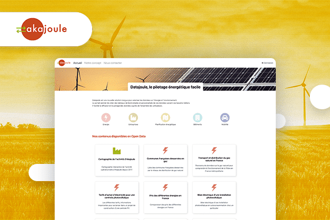
Dashboards can also be used to share public interest data, such as energy consumption in a particular area, administrative procedures, boundary maps, information on municipal budgets, the deployment of new equipment or forthcoming cultural events.
What makes a good dashboard?
A successful dashboard has to be an information and decision support tool that is adapted to the needs of those that use it, is always up-to-date, can be consumed without needing support from data teams and is comprehensive and trusted by users. These best practices enable the design of effective business data dashboards:
- Data preparation: before visualizing data through a dashboard, it is essential to ensure it is reliable and high quality.
- Data selection: the dashboard’s objective is to make data accessible to as many people as possible. This may mean that rather than showing all the available data, you need to select the most relevant information according to your objective and your users.
- Data visualizations: To facilitate understanding of the data, the dashboard must provide strong data visualizations: graphs, maps and indicators to summarize trends at a glance. These should be self-service, intuitive and interactive, allowing users to drill down to find specific information as required.
- Intuitive: the dashboard should be easy to understand and use, by both data teams and non-experts. The goal is to encourage data consumption to create business value. Ensure your dashboard has a seamless, e-commerce style design and experience to encourage self-service use, along with intelligent search capabilities to ensure information can be quickly understood.
The 3 types of dashboards organizations can deploy
There are three main categories of dashboards that can be used in organizations, as described below with concrete examples.
Reporting dashboards
Reporting dashboards provide insights and analysis to monitor performance against the organization’s global KPIs. These data analysis dashboards are normally distributed internally, especially to specific managers, enabling them to see if objectives are being achieved and to identify areas for actions and improvement.
Reporting and data analysis dashboards allow better decision-making across the organization:
- Financial dashboards: these monitor financial metrics through KPIs, such as revenues, costs and projected spend. Automating the creation of these dashboards and sharing them with the right staff reduces administration and increases efficiency. Discover how it saves insurer Lamie mutuelle three days a month.
- Management dashboards: to monitor decisions made by management and communicate them to the rest of the organization. For example, ICF Habitat, a real estate subsidiary of the SNCF Group, uses dashboards to communicate the company’s values and the minutes of its works council. In the public sector dashboards can show current performance to elected officials and the public, as shown by Australian municipality Frankston Council’s Transparency Hub.
- Strategic dashboards: to share high value-added information and enable innovation and collaboration. Schneider Electric provides key information to its partners via its data marketplace, which brings together dashboards that enable them to better manage energy consumption in buildings and increase sustainability and innovation.
The aim of reporting dashboards is to show and analyze performance against KPIs, enabling activities to be monitored and action to be taken to drive improvements. They provide a single version of the truth, ensuring consistency and breaking down silos between departments. Particularly when combined with AI, they can also be used for predictive analysis to aid longer-term decision-making.
Good to know: Although reporting dashboards are normally internal to a company, they can also be made public and interactive. The French Ministry of the Economy’s Signal Conso dashboard shows consumer products that have been recalled and complaints made against companies. Members of the public can add their own complaints and comments, with the dashboard then used by officials to take effective, informed action.
Management dashboards
Dashboards are essential to manage an organization’s daily operations. These dashboards are often enriched by front-line employees, collecting and updating information, and are then used by staff in support functions to optimize workflows, increasing efficiency and boosting productivity. For example, data quality dashboards provide information on quality within data flows, safeguarding reliability and data accuracy.
Management data analytics dashboards can be used across sectors:
- SNCF Réseau: the railway group has created internal dashboards to monitor all trains and work projects. These include a map of current operations and an analysis of interventions made to improve railway network management on a European scale.
- ICF Habitat has deployed multiple dashboards to manage its development and asset plans. In addition to dashboards summarizing all activities (such as building acquisitions and renovations), the company provides employees with data-driven tools and dashboards to increase their efficiency.
- The Town of Cary in North Carolina has created a stormwater monitoring dashboard to provide early warnings of potential flooding to staff, citizens and other municipalities.
Communication
Dashboards are also essential tools for communicating information widely via public data marketplaces. Public and private organizations use data visualization dashboards to deliver greater transparency and better communication:
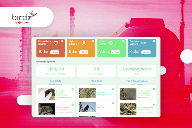
- Regulatory transparency: Many organizations are now required by regulators to publish reports on their Environmental, Social and Governance (ESG) progress. However, even if it is not mandated, sharing ESG dashboards is an essential transparency initiative to strengthen trust with stakeholders, as highlighted by the examples of energy company EDF and railway operator Infrabel.
- Sharing corporate information: banking group Groupe BPCE publishes its job vacancies in open data and has seen direct benefits in terms of higher quality applicants
- Creating a community: UK Power Networks, the largest energy network and distribution system operator in the United Kingdom, has used its public data marketplace to build a community amongst its stakeholders. By sharing relevant data through tailored dashboards it brings together partners to encourage innovation and collaboration to accelerate decarbonization.
The importance of data product marketplaces to data dashboard deployments
Data product marketplaces are central to effectively deploying dashboards at scale. They provide a central, searchable repository of dashboards alongside other data products and assets, connecting users quickly and intuitively to the right information. As well as making dashboards more accessible, they manage security, access and sharing, streamline dashboard creation, allow multiple datasets to be easily combined to enrich the experience and allow full monitoring and lineage to demonstrate performance.
Data dashboards are essential tools for communicating your data in understandable formats that support better decision-making and turn data into value through greater consumption. They have a wide range of uses, allowing organizations to optimize their operations in a global way, saving time, increasing efficiency and enabling collaboration.
